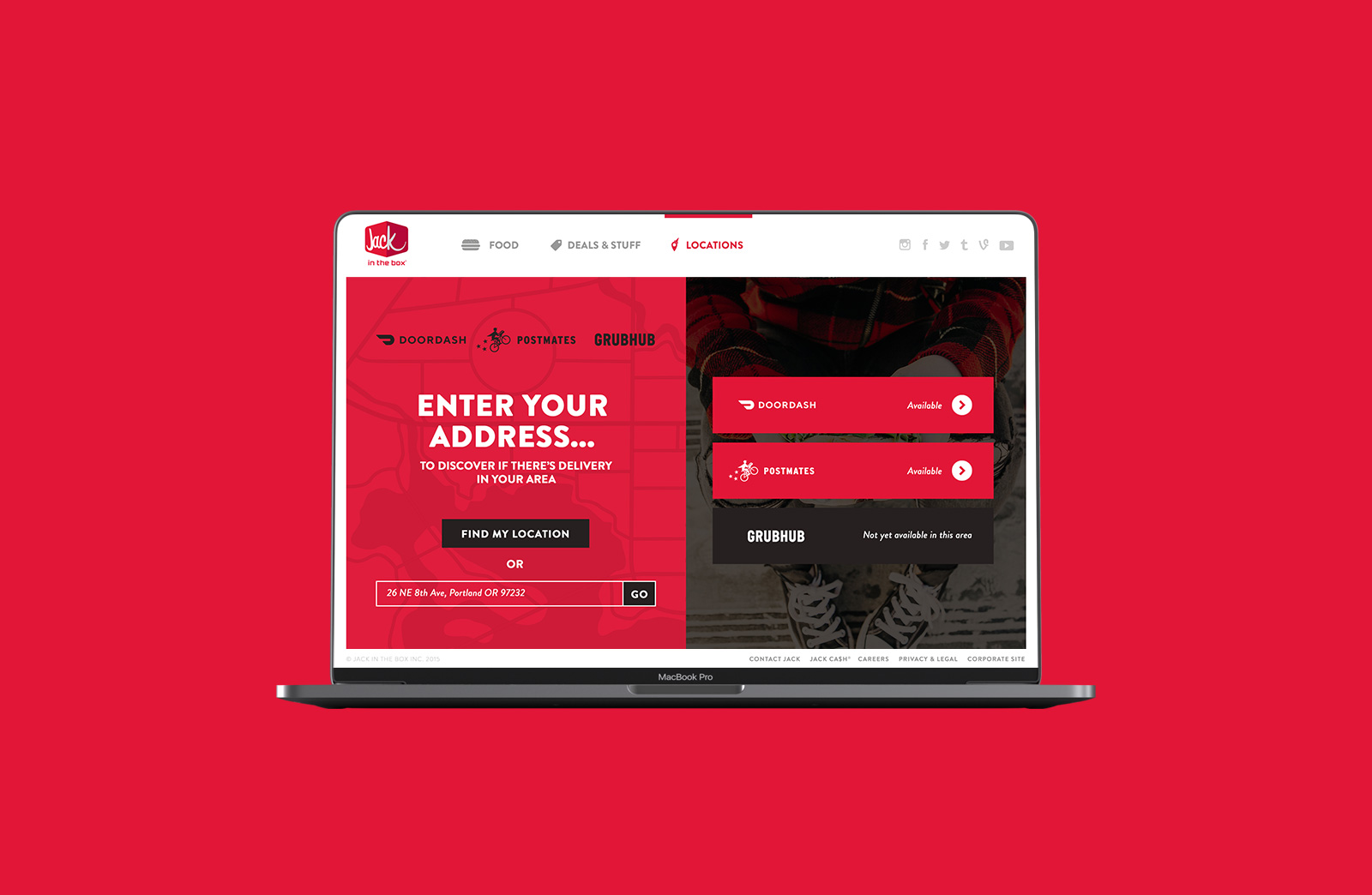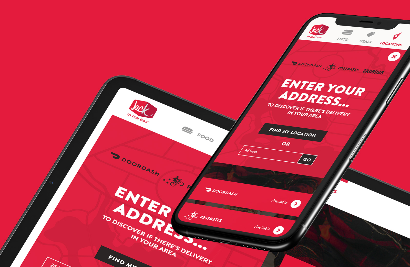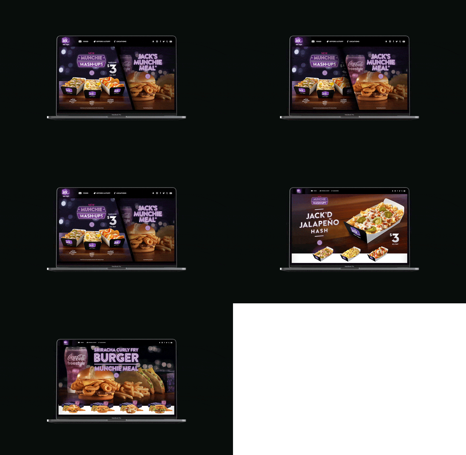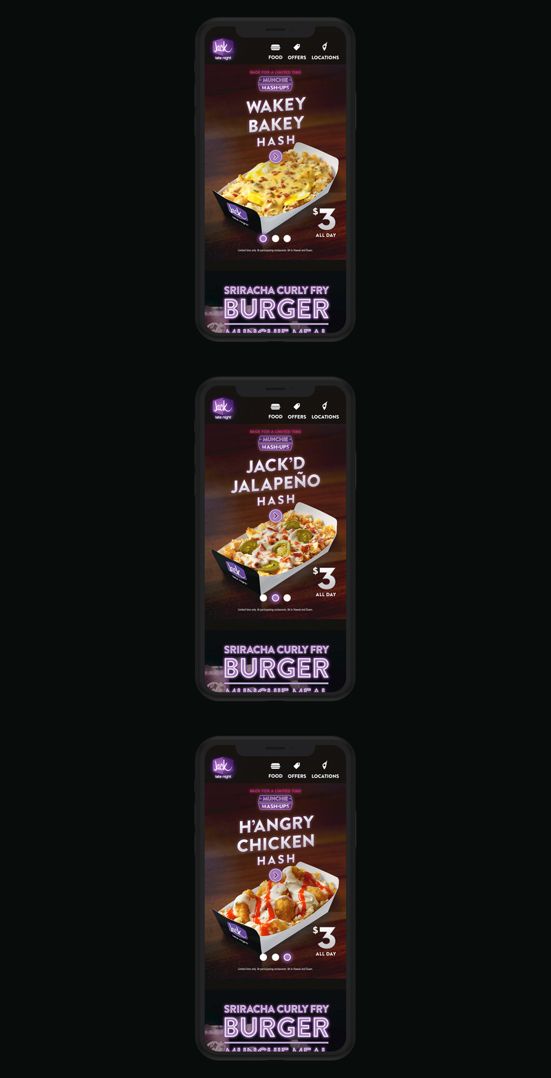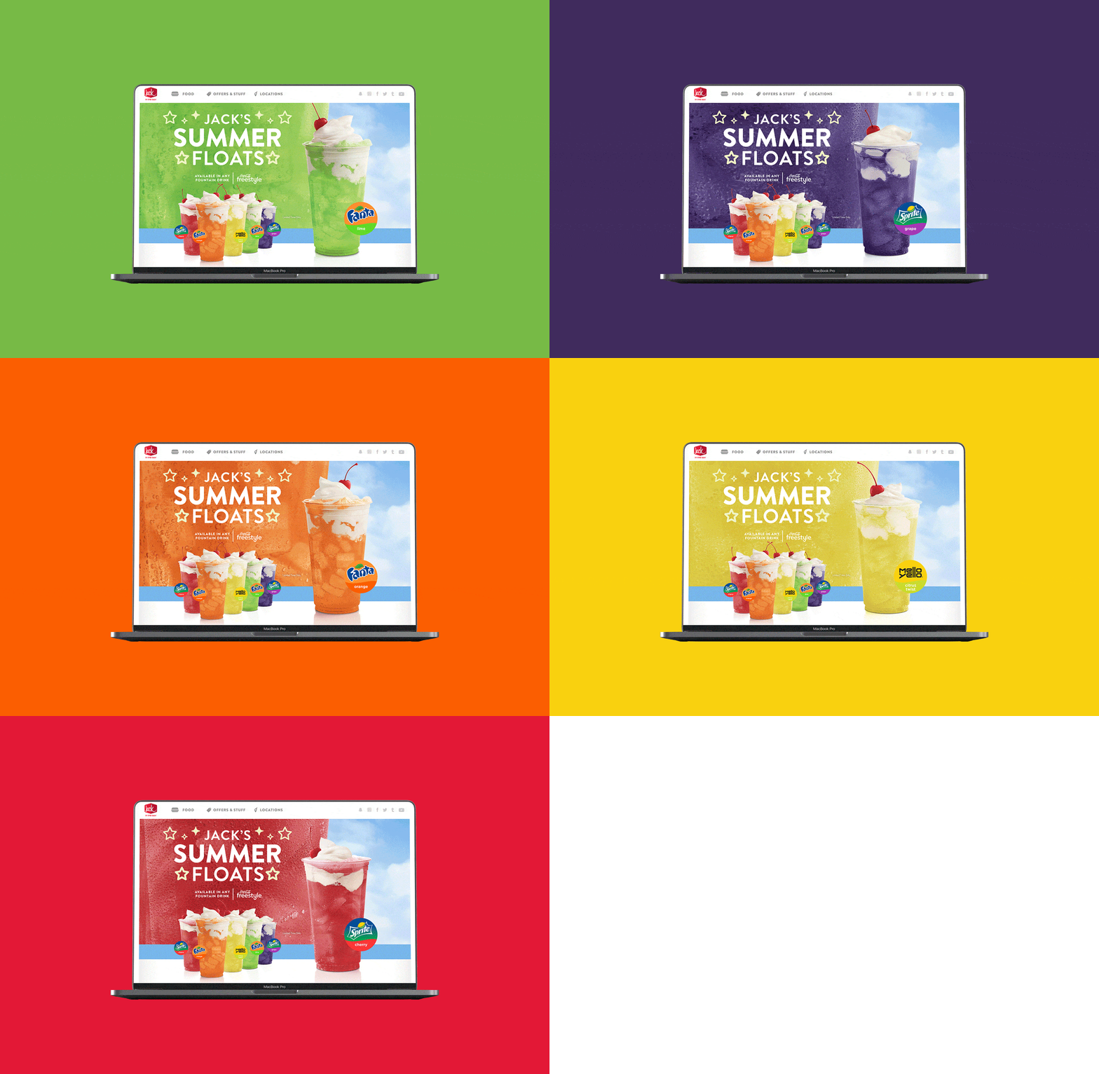
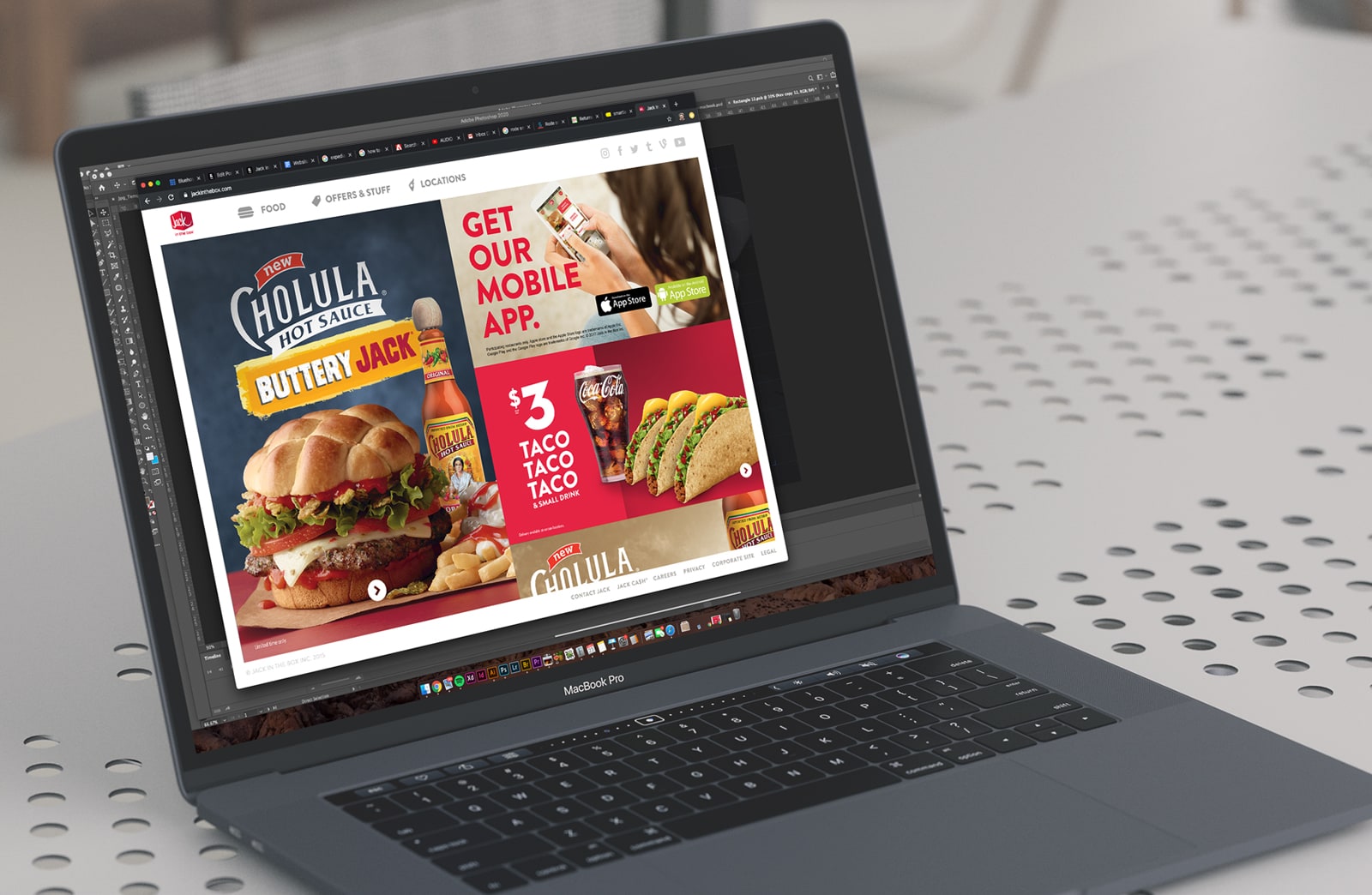
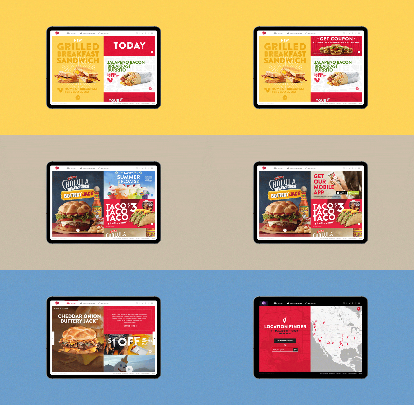
In your face marketing and easier access to coupon codes, specials and information than ever before, Jack in the Box now had a strong digital presence. Everything within this site is accessible by less than three clicks. With a 50-50 split on desktop and tablet, it allows Jack in the Box to show an impressive amount of deals and offers before the user has to scroll. The UX/UI structure allowed the primary deal to stay static left as the secondary promotions on the right can stack and scroll. We built the site in a modular, adaptive system based on screen size and device. Another interesting step was to unveil offers and border colors to coincide with the time of day/meal, no matter where you live. Our team focus: Food stays visually large for a modern audience that drives the consumer right to a nearby Jack in the Box.
Client
Role
Art Director
What I did
Desktop/Tablet/Mobile
Presentations
225
49
30
Consistency is key
For three years, ’16—’18, I worked to deliver an online user interface that stays consistent with the site build from the first year. Every 2 months Jack in the Box comes out with new and exciting menu items. I was relied upon to design their dot com campaigns to support each launch. Although there was an existing look before it hit digital, there was liberty to push the design to create a more cohesive visual experience.
