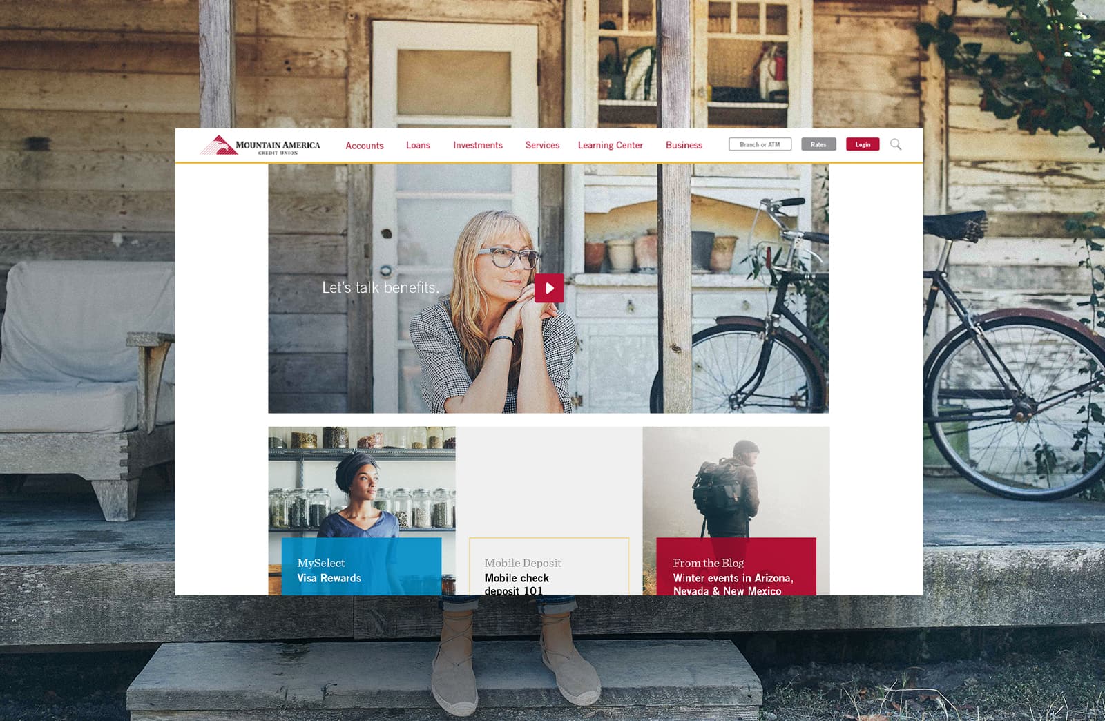
To position MACU as a leader in innovation within the financial services industry, we based the site experience—UX, functionality and design—on one key strategic position: a concierge, not a library. The idea of serving up content like a concierge versus searching for content (like at a library) enabled us to service customers and potential customers online the same way they were being treated in branches.
Client
Role
What I did
Presenting
Retouch Direction
Approach
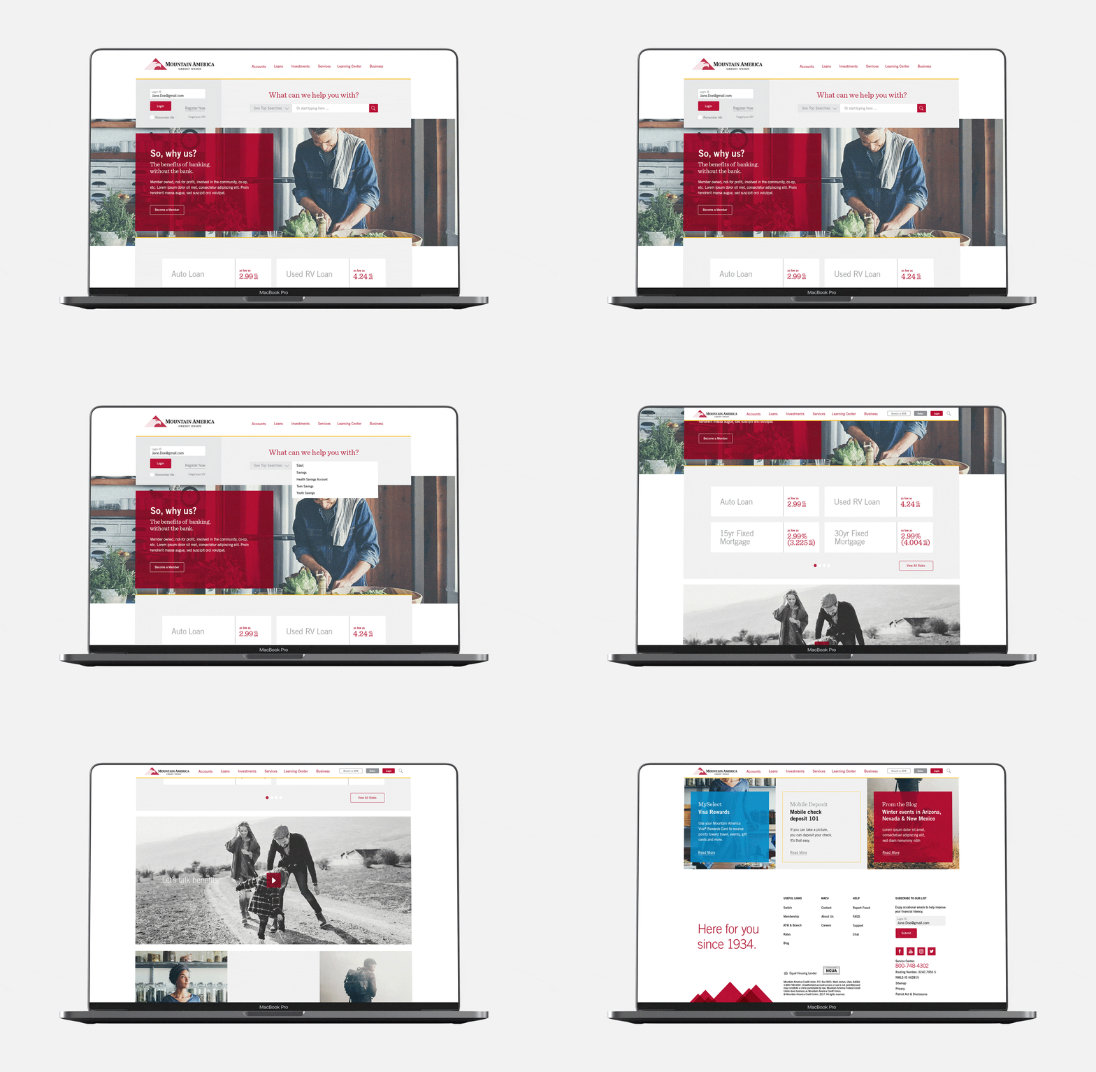
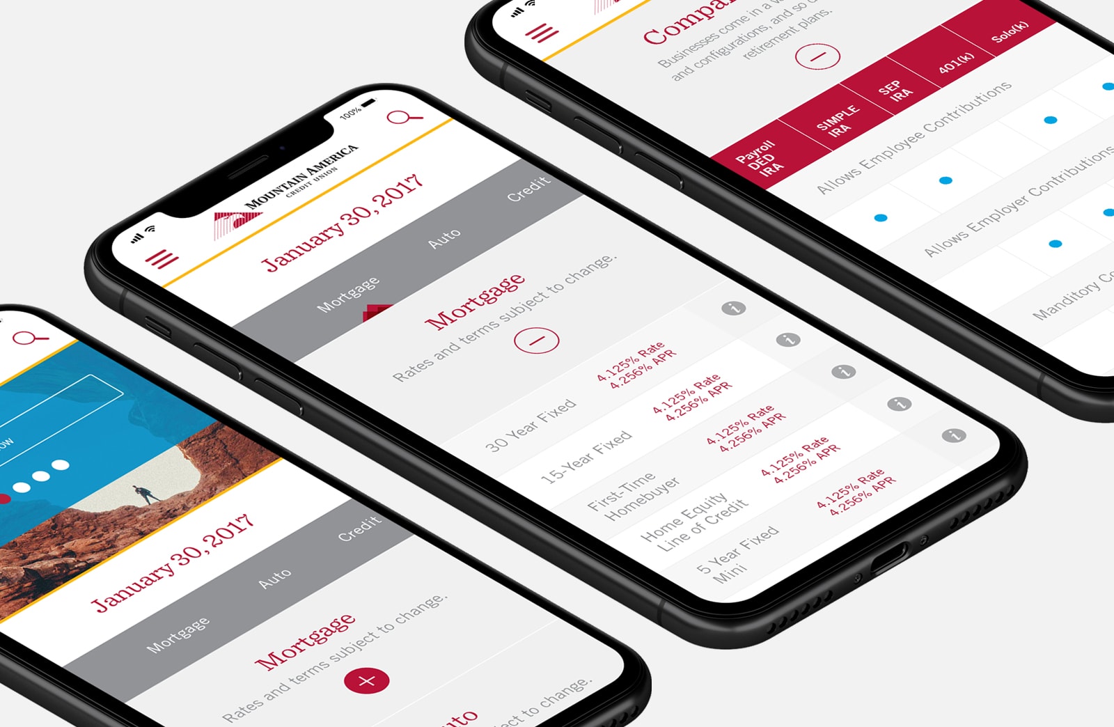
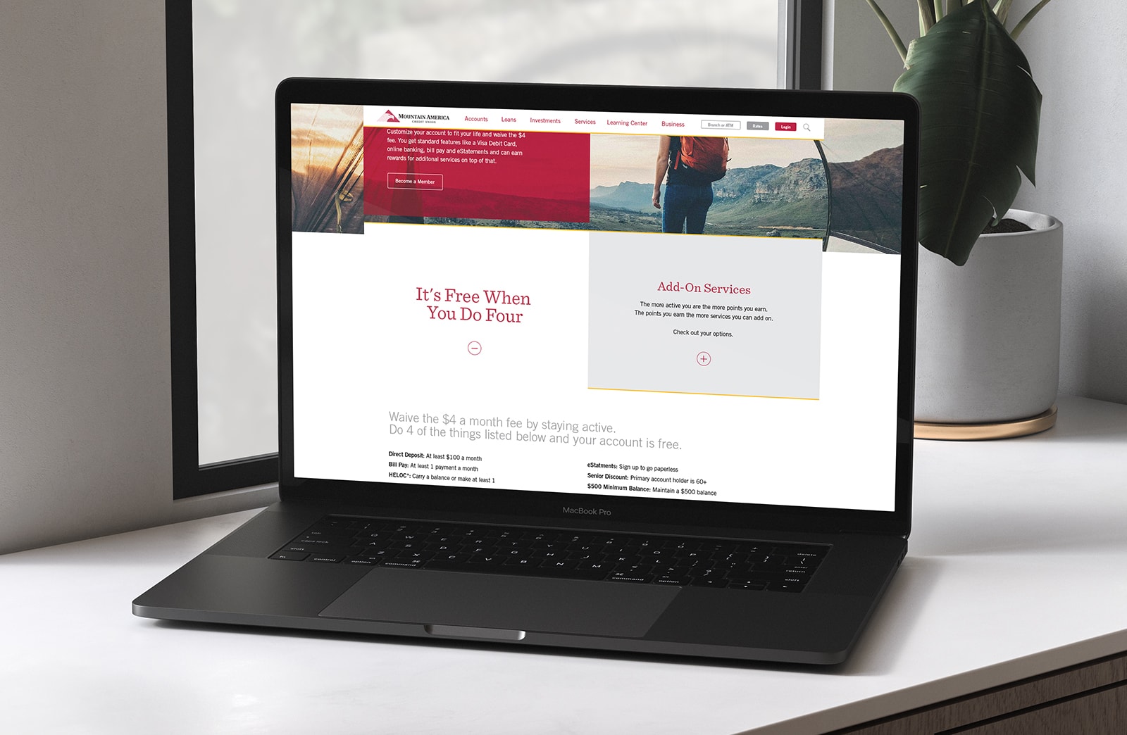
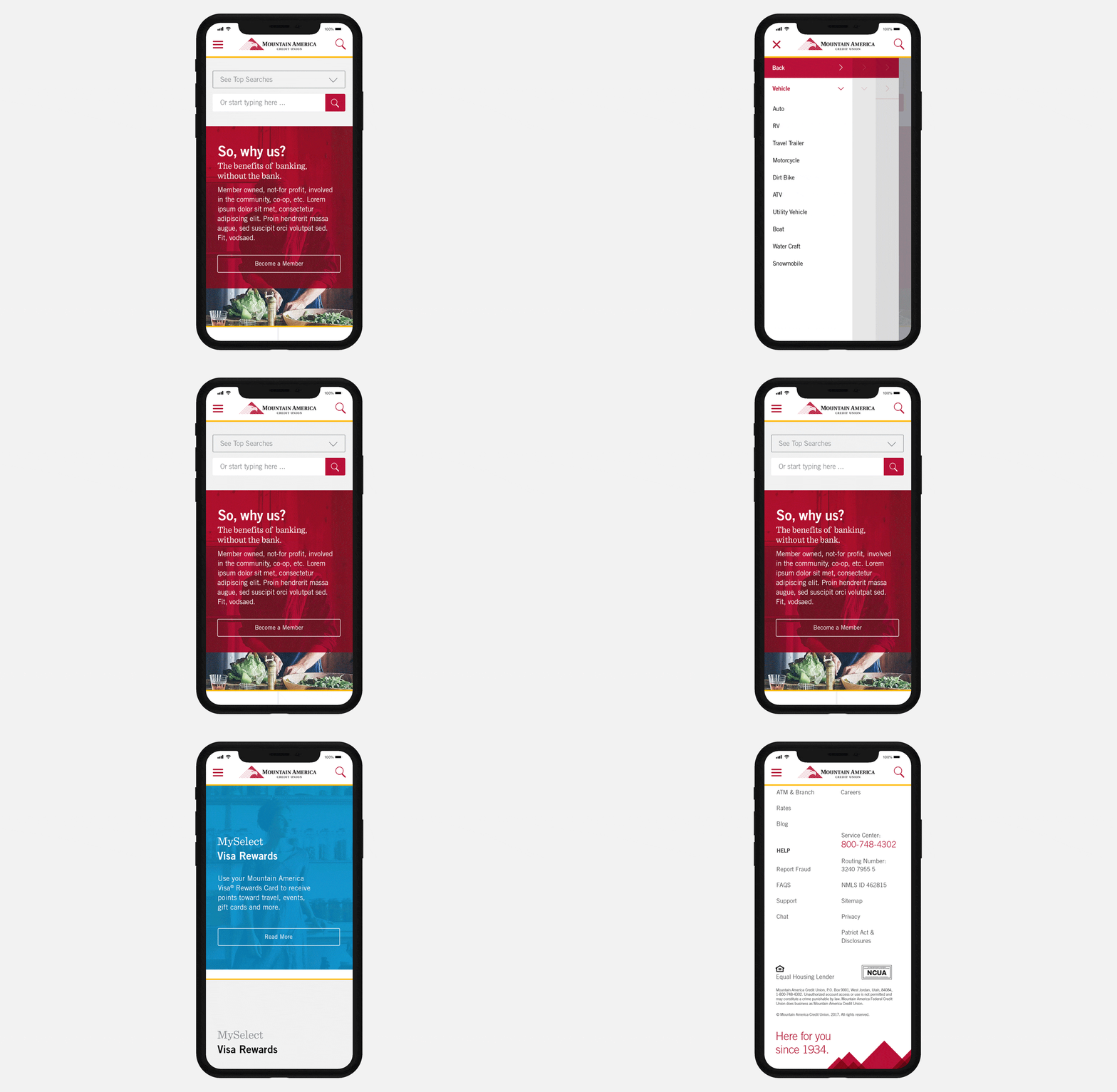
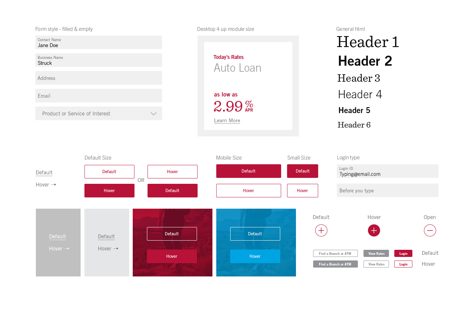
The site needed to be easy and intuitive for users of all ages which isn’t always the case. Keeping that in mind throughout the design process, there were quite a few steps made to ensure just that. I made the decision to push Macu’s secondary blue to a fresher space for digital only. This was useful in call to action buttons as well as giving the site/brand a new approachable and energetic vibe. The site was designed in a modular, adaptive system that is simple and easy for the client to update when needed. With modules, the user can articulate information in blocks versus run-on, scroll heavy content. It’s stackable as well as collapsible depending on screen size.
Macu Red
#b81237
Cement Gray + Shades
#929397
New Digital Blue
#00a4e2
Existent Slate Blue
#5a7c94
Macu
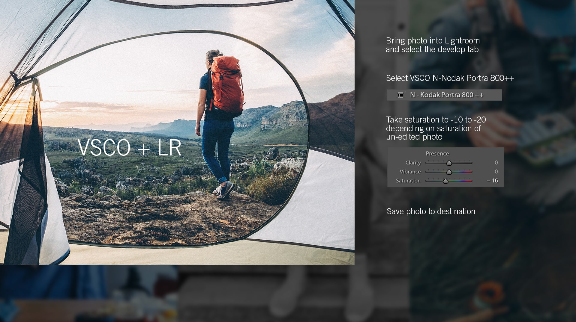
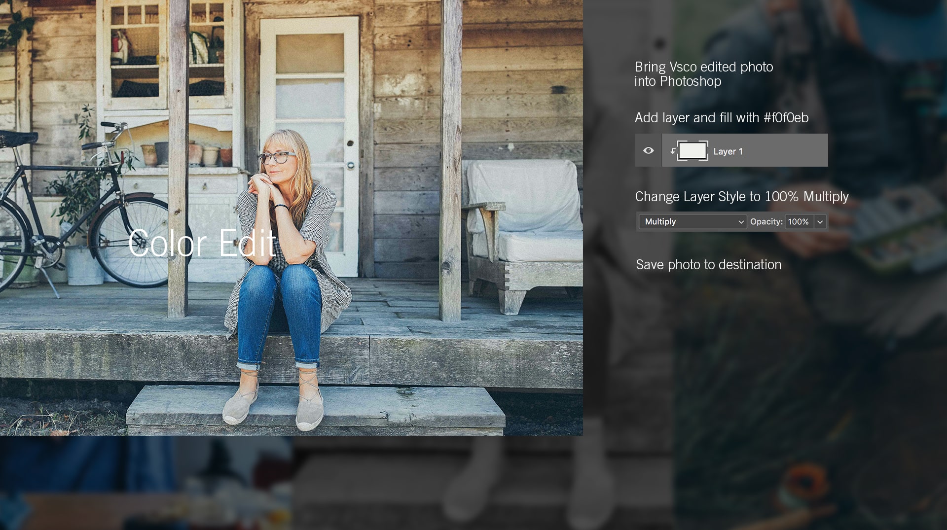
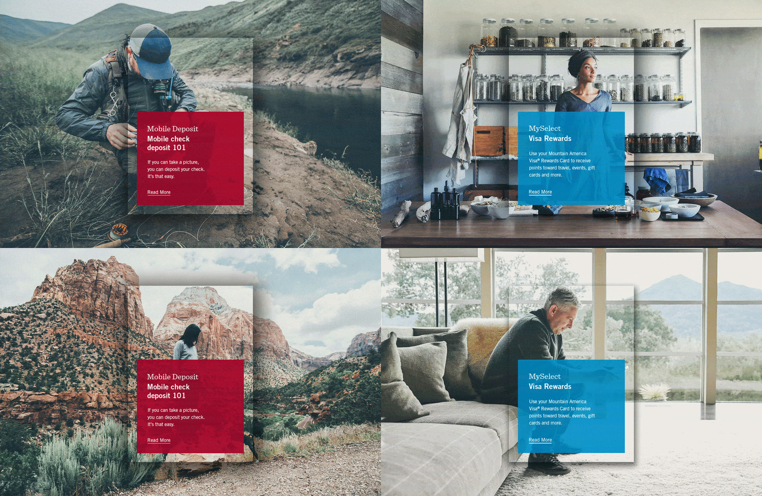
Photo direction
The photography needed to be relative to many and kept that in mind when sourcing content. I took Macu’s design team through a photo tutorial and taught them what genre/look to go for when purchasing stock photography. The consistency of the photos, their edits and their personality, strengthens the brands authenticity.
