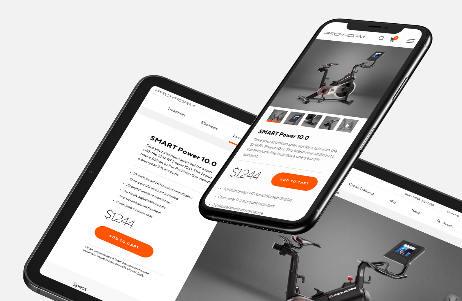
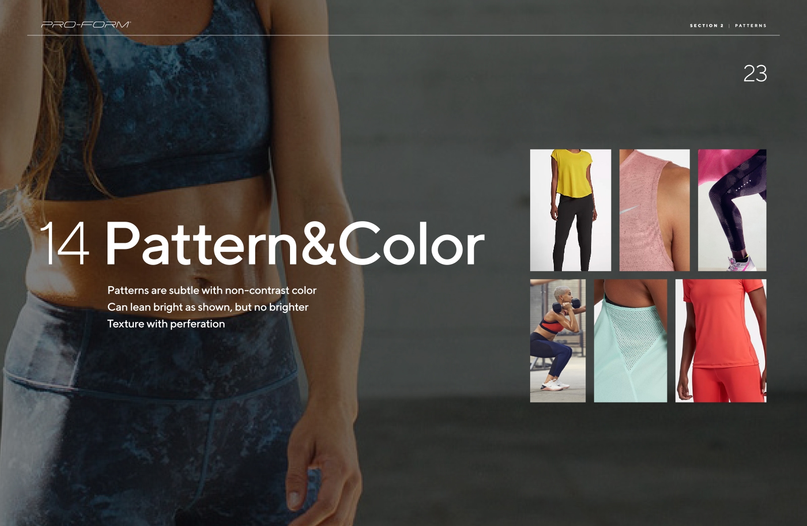
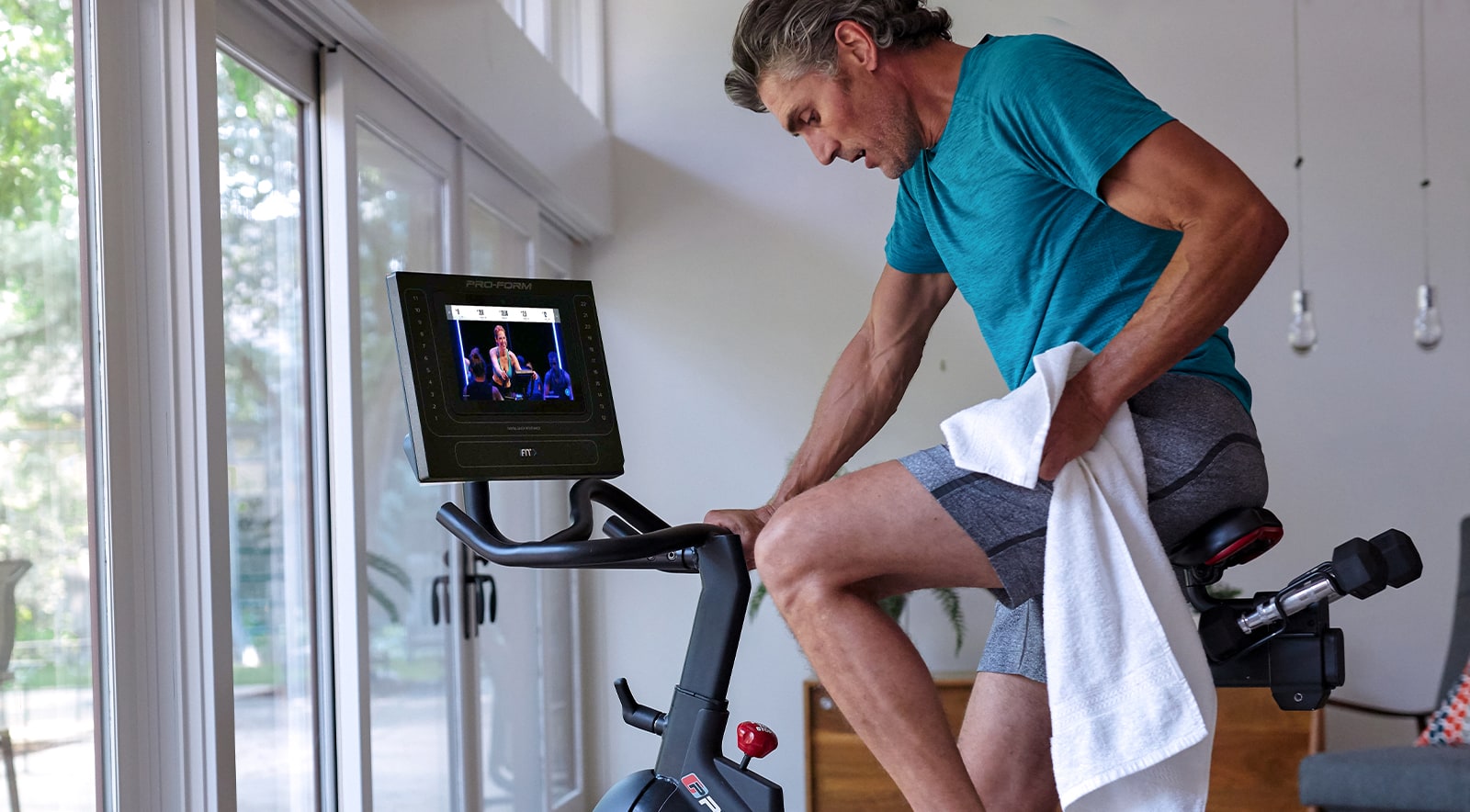
Proform was morphing into a subscription based company. No longer was this about selling just a workout machine, but a lifestyle. They had thousands of online classes which promotes a different workout world than the past. When you went to their site, it lacked not only the technology to support this new model, but a cohesive visual aesthetic as well. The photography showed an affordable machine in an unaffordable home and the body types on those machines looked unattainable and intimidating. The digital brand lacked lifestyle and simplicity in many ways. To support the subscription based theory, the Proform brand needed to exist comfortably in peoples homes more than ever before.
Client
Role
UI Design Lead
What I did
Brand Guide
Content Guide
Retouching




Approach
I worked alongside a team of strategists, copywriters and designers to build a successful position for Proform to compete. For copy, we set messaging which included a core position, tagline and manifesto. After that, we set visual goals in the digital world for the Proform team to hit and prefaced how to accomplish each goal along the way. This project was an overall lift to their brand, their website and their content both in video, photo and messaging.
Digital
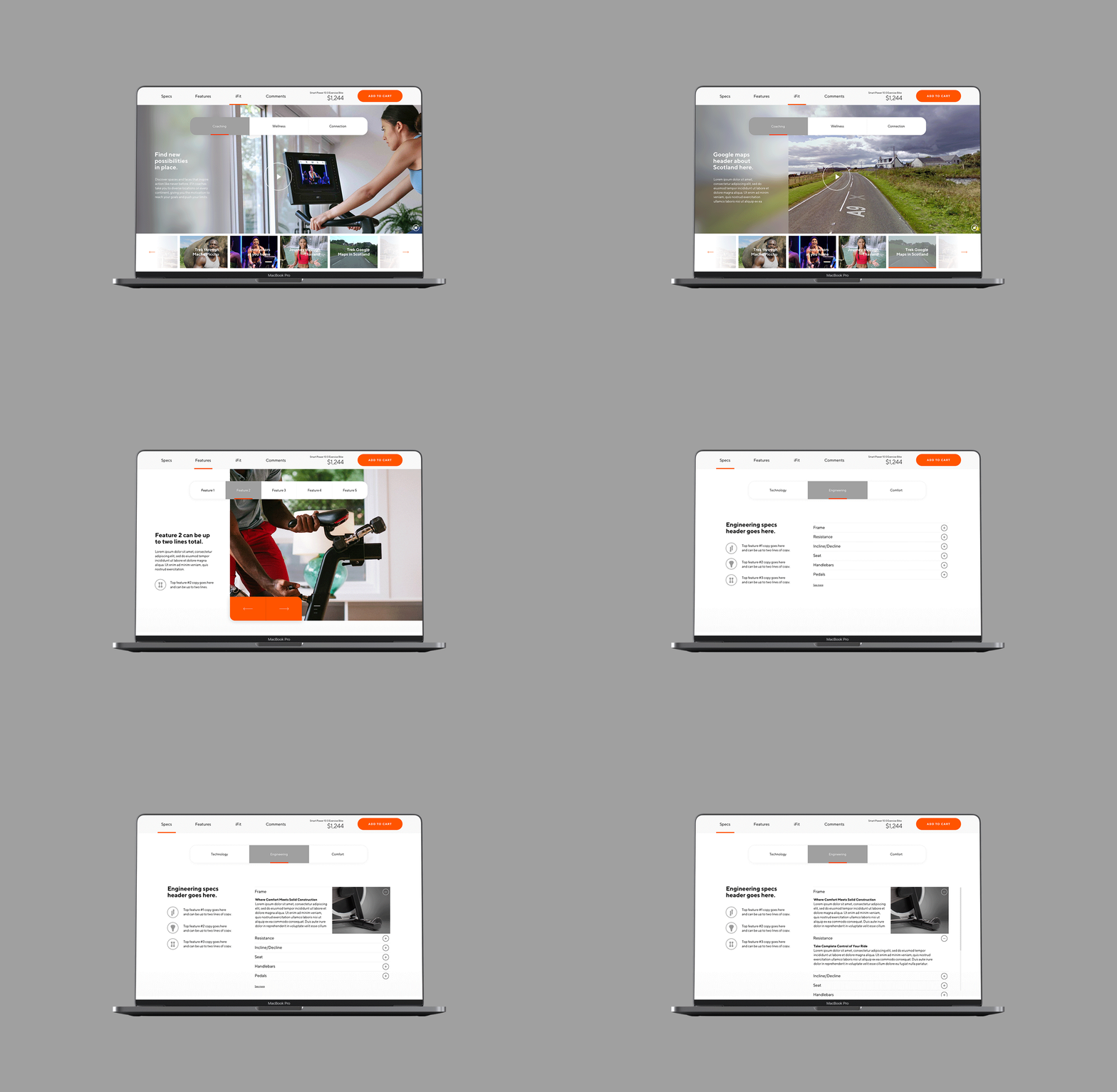
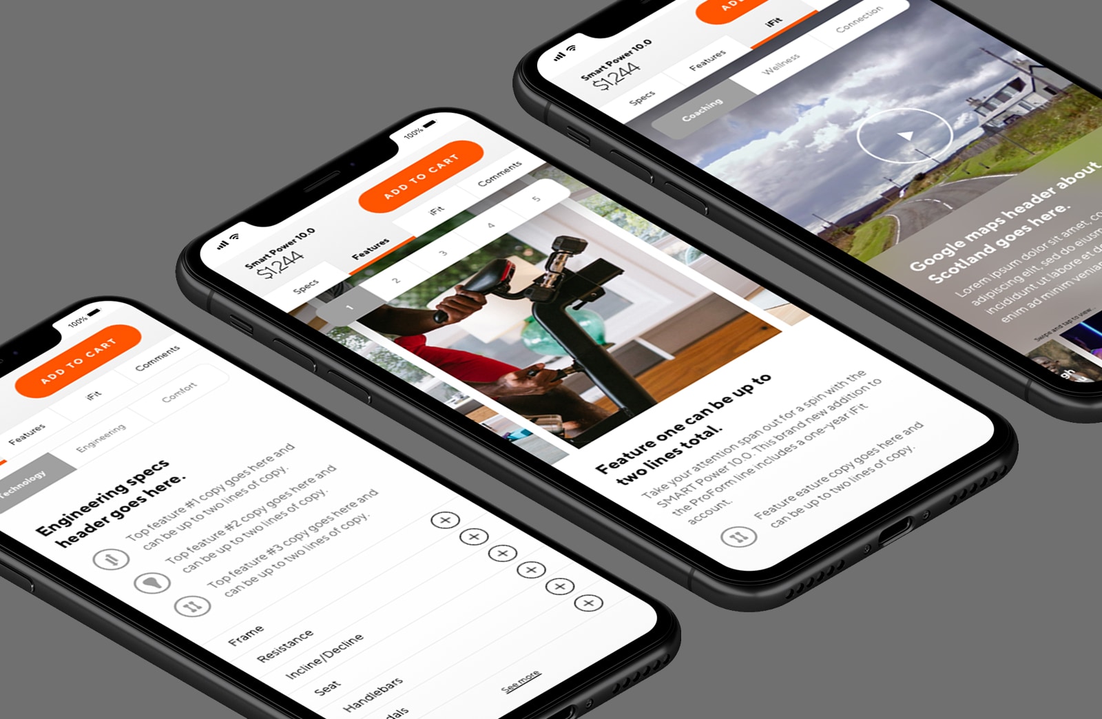
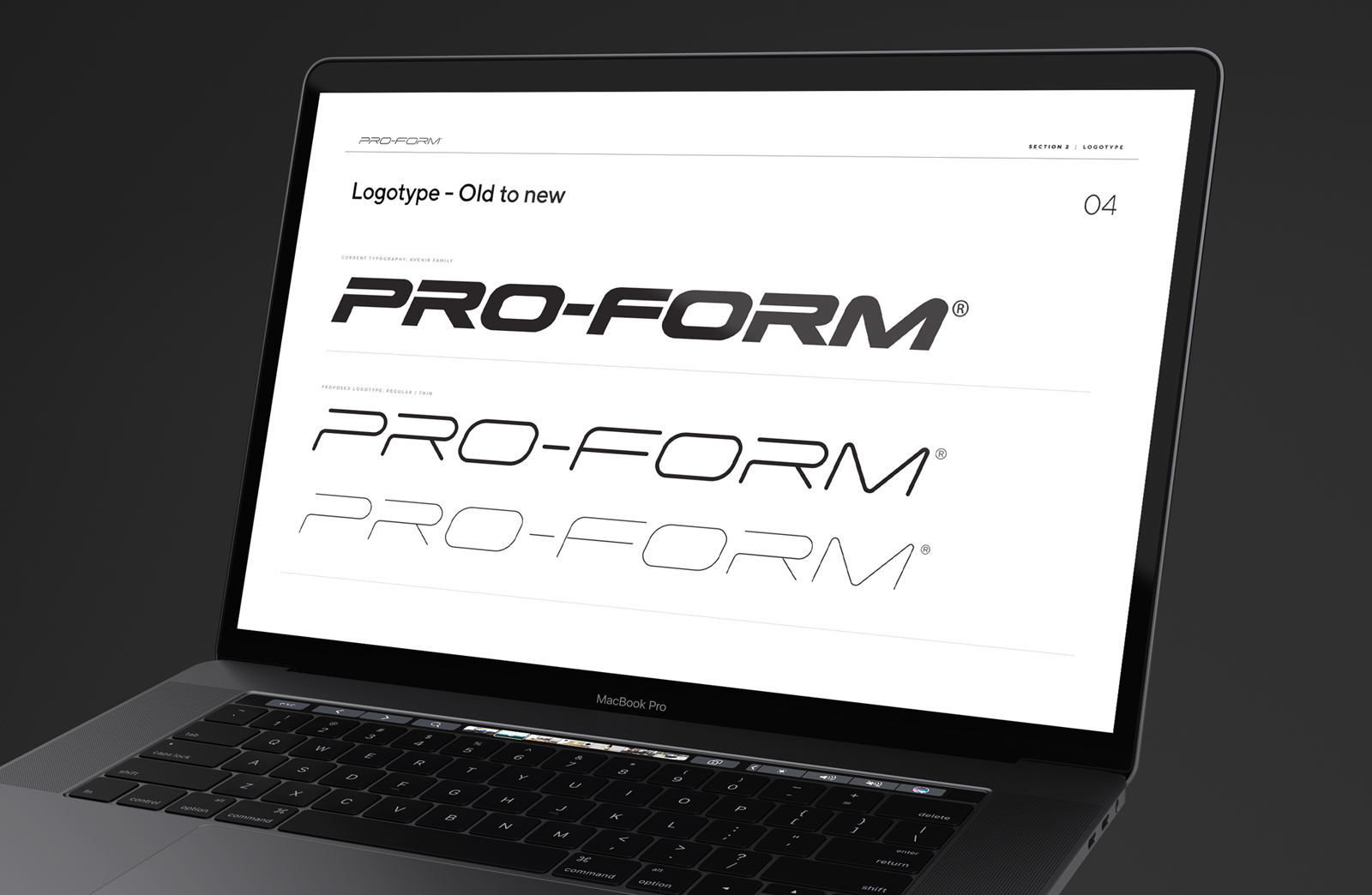
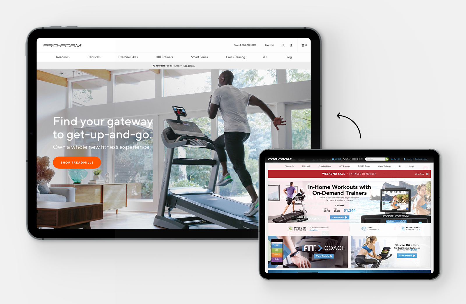
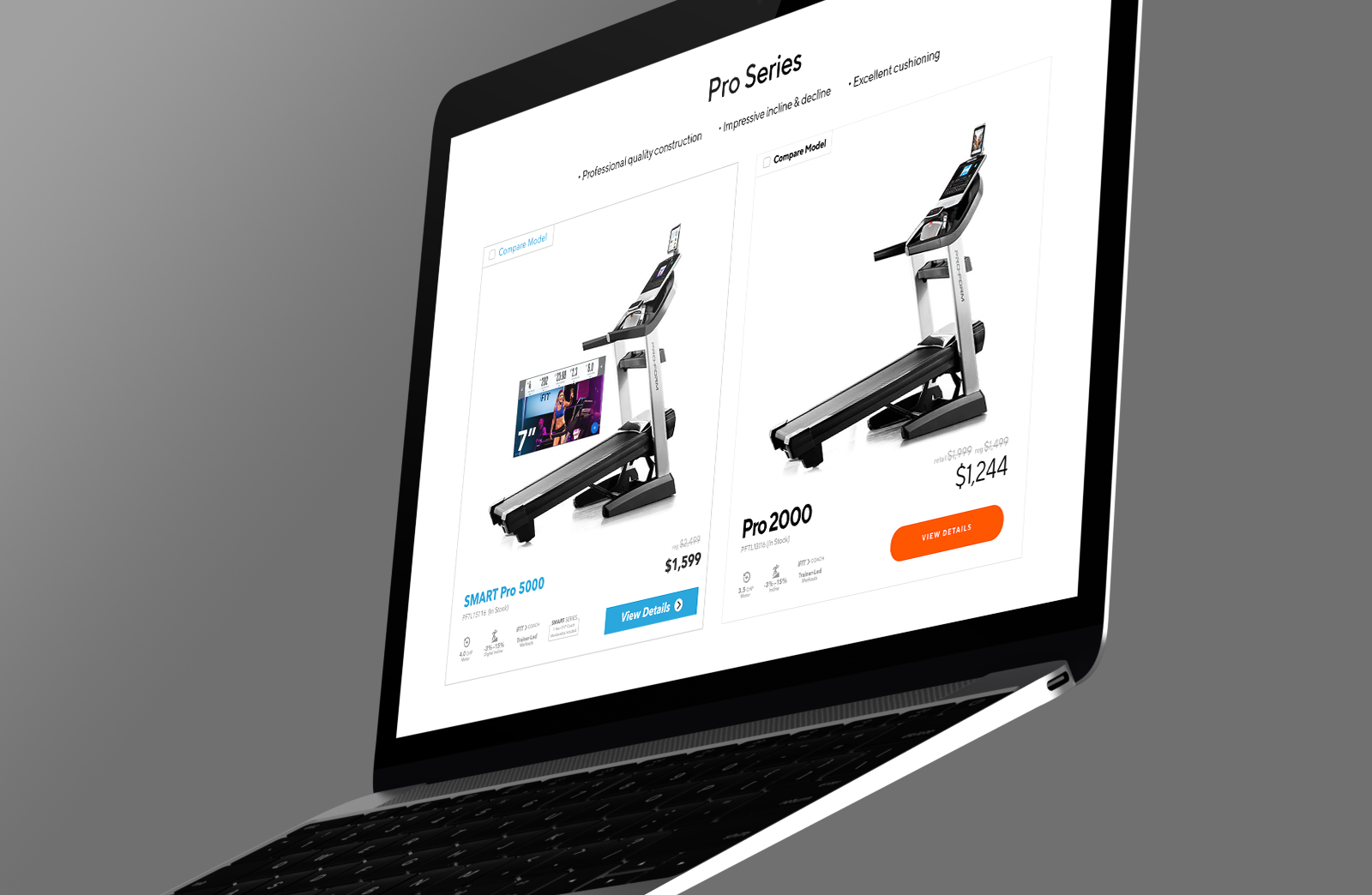
Digitally, their site needed a re-skin/new standard if you will. The first step was to minimize the use of colors, create new CTA’s and implement a new web font across the board. With this refresh, Proform also needed to unveil their new app, iFit. iFit is an app which houses thousands of instructor led workout videos that the user can choose from. Proform didn’t have the video content yet to market, but needed something online as a quick fix. Because of this, I created a UX/UI structure with tabbed content to sell the iFit experience which you’ll see below.
Electric Orange
#ff5400
Deep Gray
#707070
Slate
#a0a0a0
Optic Cloud
#ededed
